Antique Olive
 | |
| Category | Sans-serif |
|---|---|
| Classification | Humanist sans-serif |
| Designer(s) | Roger Excoffon |
| Foundry | Fonderie Olive |
| Date released | 1962-1966 |
| Design based on | Gill Sans |
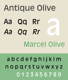
Antique Olive is a humanist sans-serif typeface ("antique" being equivalent to sans-serif in French typographic conventions). Along the lines of Gill Sans, it was designed in the early 1960s by French typographer Roger Excoffon, an art director and former consultant to the Marseilles based Fonderie Olive.[1] In addition to a basic weight, Antique Olive was produced in medium, condensed, wide, bold, condensed bold, extra bold (known as Antique Olive Compact), and ultra bold (known as Nord).[2] The key shapes, especially the letter O, resemble an olive, which is one of the characteristics which make Excoffon's typefaces unique.
Lewis Blackwell later commented on the design, "An attempt to offer a more refined sans serif than presented by Helvetica and Univers, but it was too characterful and too late to be widely adopted outside France."[3]
The face was later made available in cold type and digital versions are now offered by Adobe Systems and Linotype. A very limited set of styles digitised by URW++ has been released as open-source software as part of the Ghostscript project.[4]
References
- ↑ Provan, Archie, and Alexander S. Lawson, 100 Type Histories (volume 1), National Composition Association, Arlington, Virginia, 1983. pp. 16-17.
- ↑ Jaspert, W. Pincus, W. Turner Berry and A.F. Johnson. The Encyclopedia of Type Faces. Blandford Press Lts.: 1953, 1983, ISBN 0-7137-1347-X, p. 2408-249
- ↑ "Antique Olive". The Typehead Chronicle. 1999-02-22. Retrieved 2011-10-20.
- ↑ "URW font ttf conversions". Ghostscript. Retrieved 22 September 2015.